
Full Production
1.
Editing & GFX
2.
Performance Video
3.
Agency Commercial
4.
Brand Development
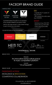
FaceOff Case Study: Crafting a Bold Identity
Industry: Music, Entertainment
Platform: Web & Mobile App
Objective: To develop a dynamic, high-energy brand identity that embodies FaceOff’s competitive, innovative spirit while fostering community engagement.
Website: faceoff.com
The Objective
Create a high-impact, trust-building brand identity that captures FaceOff’s passion, innovation, and competitive spirit, while fostering a strong sense of community and engagement within the music space.
The Solution
We brought the energy, and the artists brought the performance. Here’s how we crafted FaceOff’s standout identity:
1. Bold Brand Identity
We designed a logo that screams competitive spirit, using the dual “F” to symbolize collaboration and passion in equal measure. The visual system is built to stand out in the crowded music scene—memorable, scalable, and dynamic.
2. Energized Messaging
From the tagline, “It’s a FaceOff!” to a color palette that balances power with precision, we created a voice that’s as bold as the artists it serves. Every choice reinforces the core values of passionate action, excellence, innovation, and collaboration.
3. Structured for Growth
This brand is built for the long haul. A flexible design system allows for seamless expansion into events, partnerships, and merchandise, ensuring FaceOff can evolve without losing its identity.
Conclusion
High-Impact Market Entry – FaceOff launched with immediate recognition and a loyal artist following, ready to compete.
Engaged Audience – Messaging and visuals connected with the community, sparking excitement and participation.
Scalable Growth – A robust brand system allows for easy expansion into new opportunities while maintaining consistency.
This brand development project showcases how a well-crafted identity goes beyond aesthetics. It’s about transforming abstract values into something tangible—a brand that feels like FaceOff even before a word is spoken.
5.
Brand Development

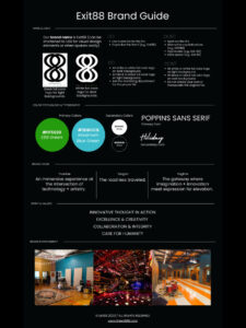

E88 Case Study: Innovation in the Making
Industry: Technology, Creative Services
Platform: Web, Mobile, and Custom Digital Solutions
Objective: To craft a sophisticated, intentional brand identity that reflects Exit88’s multidisciplinary mastery across tech, media, and design while cultivating trust and a premium client experience.
Website: theexit88.com
The Objective
Create a refined, flexible brand identity that speaks to Exit88’s role as a strategic partner for creatives, entrepreneurs, and organizations seeking custom technology and multimedia solutions—with an emphasis on excellence, intention, and innovation.
The Solution
Exit88 wasn’t built just to look good—it was built to solve problems elegantly. Here’s how we brought that clarity to life:
1. Elevated Brand Identity
We designed a modern, sleek logo with clean geometry and subtle symbolism—bridging art and engineering. The “88” visually hints at infinity and exit points, suggesting timeless solutions and future-focused innovation. The identity balances modern minimalism with intelligent flair, perfect for a high-performing agency.
2. Intentional Messaging
Exit88’s tone is confident, sharp, and insightful—rooted in a mission to create at the intersection of artistry and technology. Messaging focuses on delivering “solutions with intention” and positions the brand as both expert advisor and collaborative partner. The tagline, “No fluff. Just flow,” distills the essence of how Exit88 works: purpose-driven, seamless, and always premium.
3. Dynamic, Scalable System
Exit88’s brand system was developed to flex across service lines—from UI/UX design and software development to brand architecture and digital media production. The brand kit includes:
-
Logo variations for light/dark modes
-
A bold yet minimal color palette with a hero coral tone to evoke creativity and movement
-
A structured grid system and digital-first typography for clean presentation across platforms
-
A full icon suite and branded collateral to unify digital and print presence
Conclusion
Premium Presence – Exit88’s brand identity instantly conveys professionalism, creative fluency, and digital mastery.
Strategic Engagement – Messaging connects with visionaries and problem-solvers, positioning Exit88 as a trusted collaborator.
Built for Expansion – The system supports scale across industries, platforms, and services without compromising brand coherence.
This brand development reflects more than a visual style—it articulates Exit88’s values through every touchpoint, turning complexity into clarity and creativity into results.
6.